
The Psychology Behind Color and Type
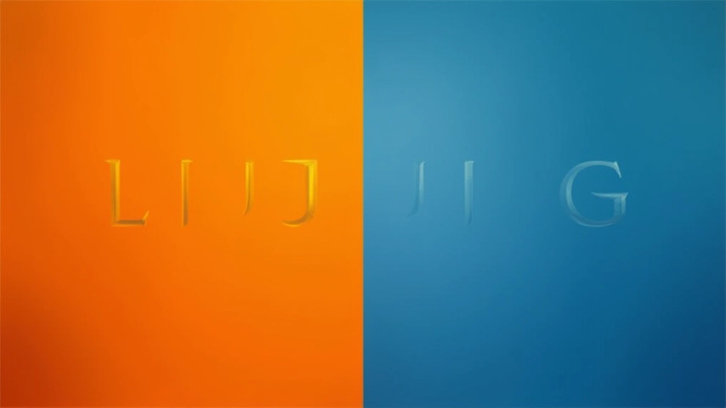
Color and typography don't work in isolation. They're a partnership. When you pair warm oranges with a delicate serif typeface, you're sending completely different signals than pairing that same serif with cool grays. It's not random — there's actual psychology happening.
Think about the brands you trust. Luxury fashion brands pair elegant serifs with jewel tones. Tech companies pair sans-serifs with bright blues and minimal color. Fast food chains pair rounded sans-serifs with warm reds and oranges. These aren't accidents. They're deliberate combinations that make you feel something specific.
The key insight: serifs feel traditional, trustworthy, and formal. Sans-serifs feel modern, clean, and approachable. Warm colors (reds, oranges, yellows) feel energetic and urgent. Cool colors (blues, greens, purples) feel calm and professional. When you understand how these combine, you can control what people feel when they see your design.
Warm Colors with Serif Typefaces
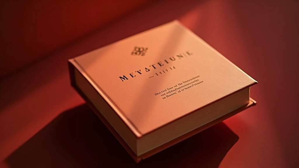
When you pair warm colors with serifs, you're creating something that feels timeless and premium. Warm colors alone can feel chaotic — think neon orange. But put that warmth with a traditional serif typeface, and suddenly it's sophisticated. It's why high-end chocolate brands, wineries, and jewelry companies love this combination.
The warmth adds personality and energy. The serif adds credibility and heritage. Together, they say: "We're established, we're trustworthy, and we're worth paying attention to." A burgundy with a classic serif doesn't feel cheap — it feels like something special. Warm golds paired with serifs? That's luxury.
Real example: Luxury watch brands often use deep warm browns or gold tones with serif typography. The color says "precious" and "warm," while the serif says "traditional craftsmanship." The combination is irresistible if you're trying to convey quality and heritage.
Cool Colors with Sans-Serif Typefaces
This pairing is everywhere in tech and modern brands. Cool colors (blues, teals, grays) with clean sans-serifs create instant trust and clarity. It's the default for startups, healthcare apps, and financial services. And for good reason — it works.
Cool colors feel calm and professional. Sans-serifs feel modern and accessible. Put them together and you're saying: "We're current, we're reliable, and we get you." It's not fancy — it's practical. You're not buying into heritage, you're buying into innovation and efficiency.
A bright blue with a modern sans-serif doesn't feel cold — it feels energetic and forward-thinking. A soft teal with a clean geometric sans-serif? That's trustworthy and human. This combination is perfect when you need people to feel comfortable and confident in your brand.

Breaking the Rules (When It Works)
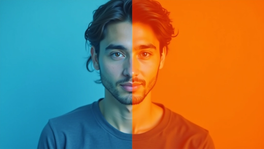
Here's where it gets interesting. The rules I've shared? They're not laws. They're patterns. And once you understand the patterns, you can break them intentionally.
Some brands pair warm colors with sans-serifs specifically to stand out. That bright orange with a clean geometric sans-serif suddenly feels playful and disruptive. A cool purple with a classic serif becomes artistic and unconventional. When it's done deliberately, it can be more memorable than following the rules.
The trick: you need contrast and intentionality. Don't pair them accidentally. Pair them because you want people to feel something unexpected. A few brands do this brilliantly. Most don't. But when you see it done well, it stands out.
Practical Steps to Get Started
Choose Your Typeface First
Decide if you're using a serif or sans-serif. This choice determines half your color strategy. Serifs lean toward warmth and tradition. Sans-serifs lean toward cool and modern.
Pick Your Color Temperature
Warm (reds, oranges, yellows, warm grays) or cool (blues, greens, purples, cool grays)? Your typeface choice already nudged you one direction. Follow that nudge or deliberately go against it.
Test with Real Text
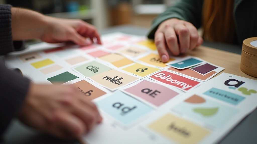
Don't just look at color swatches. Put your chosen color behind actual paragraphs of your chosen typeface. Read it. Does it feel right? Does it communicate what you want?
Check the Contrast
Make sure text is actually readable. A beautiful color combination that's hard to read is just frustrating. Use a contrast checker tool (WCAG standards). Aim for at least 4.5:1 ratio.
The Takeaway
Color psychology and typography pairing isn't mystical. It's not magic. It's understanding that colors and typefaces communicate feelings, and when you pair them intentionally, you amplify that communication. Warm colors with serifs feel established and luxurious. Cool colors with sans-serifs feel modern and trustworthy. And when you break those rules deliberately? That's when things get memorable.
Start noticing these pairings in the brands around you. You'll see the patterns everywhere. Then, when you're designing something, you'll know exactly what combination will make people feel what you want them to feel. That's the real power here.
Disclaimer: This article is informational and designed to help you understand color psychology and typography principles. Design choices depend on your specific context, audience, and goals. Individual responses to color and typography vary by person and culture. Test your choices with real users and adjust based on feedback.